How to Design Engaging Online Forms and Increase Conversion Rates
Online forms are gateways to converting visitors interested in your service, into customers with whom you build reciprocal relationships.
A form on a web page, isn’t just there to be, you know, a cool looking form.
It’s there to be filled out
Naturally, as there are almost always more people not interested in your service than those who are, forms are more often abandoned rather than filled.
But that’s not the point.
It especially sucks to lose visitors who are in fact interested in your service, even willing to pay for it perhaps, but still leave because of other unnecessary inconveniences, most of which are caused by how the form is designed.
See, that’s a punch in the belly. You don’t want to hurt those conversions any more than you have to.
With the obligation to design a well-engaging form, not just a well-functioning one, you also wouldn’t want us to say: “here, a bunch of fields to create your dream form. Use them and be happy”.
Nope, that’s a very bad idea.
It’s our duty to help you create forms that are successful in meeting your objectives.
So, in this post, I’ll list some hints to make your forms more engaging, and live up to their highest possible efficiency.
According to wpforms by the way, the average form abandonment rate is around %68, and form abandonment during the filling process is about %81.
Alright, before we begin, let me emphasize a common way form abandonment happens. I’ll talk about a specific moment that takes place before the filling even begins.
I’ll call it the "meh moment".
The "meh moment" is when a visitor on a website, after a glance at or skim
through the content, gets psychologically overwhelmed by the thing, finds it too complex,
and with that pressure, decides: “Meh, it’s too much work to go through all of this, I’ll just
leave it.”
Remember, the content doesn’t have to be a form, or even something that requires CTA (call-to-action). It can be any content, related to anything.
In today’s time when we get bored so fast, and our attention span is getting shorter, the "meh moment" is very common.
So, when a visitor navigates to your form, you might have as short as seconds before you lose them.
Okay then, we must design our forms carefully so that we can capture sufficient attention from our specific audience, before we lose them to the meh moment.
So, let’s get to it.
Content
Here I am, navigating to the page of your form, the first glance and hopefully the quick scan happen.
Clarity
Right at the beginning, the form should instantly tell me what type of a form it is and what it’s about.
Remember, the meh moment is waiting right around the corner. If filling out this form is to my benefit, I need to see that, quickly.
A basic example would be this short contact form which we use on FormPress homepage.
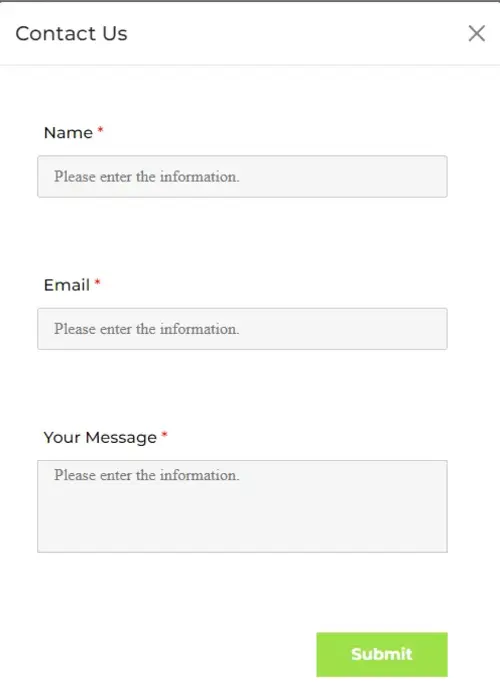
I know, it's very basic, but it delivers the general idea: keep it clear and simple.
If I need help from FormPress team, and I see this form pop up, I instantly know I am where I'm supposed to be.
Title
The first piece of text that I’m going to read is probably the title of your form.
So, it’s crucial.
You need to make sure that the title is clearly indicating what the form is about. Let's look at another example.
As you see, the title and sub-title clearly indicate that this is an attendance form for an event, and it's RSVP(please reply).
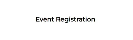
But look at this one.

Okay, a registration form that is. Well, registration for what?
You see, this sort of blur on parts of your forms, whether it be the title or following questions, may irritate form respondents, thus causing them to leave.
Avoid Unnecessities
This is very important.
As you prepare the form, laying out the questions, try to collect only information that you must collect.
If there’s anything on your form that perhaps doesn’t have to be, or worse, shouldn’t be there, that’s bad.
Sad finding: It cost Expedia, an online travel shopping firm, $12 million in lost profit to have a rather confusing field like "Company Name" on their forms. Details.
So, be careful with those unnecessities and irrelevancies.
When it comes to private information, for example, ask such questions only when absolutely necessary. You don’t want me to think: “Why are they asking for my phone number? There doesn’t seem to be any good reason for that.”
On another hand, also think about your “optional” fields. You can have them, of course. A nice “Would you like to comment?” kind of field at the end wouldn’t hurt your form.
However, you don’t want to exaggerate optional fields.
If it isn't a must, there shouldn’t be too many variants of it.
Questions
The same rule of clarity applies here. The questions should be clear, directly telling me what information they want.
No question should ever be longer or more complicated than is necessary.
Generally speaking, the “less is more” idea is not a cliche here. It seems to work very well.
Take a look at this example.
and this one
Well :) You tell me.
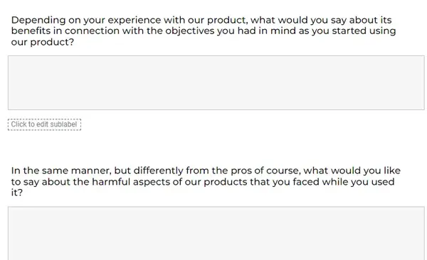
Still though, we can’t make all content short. Some forms, or questions, have to be long. We can’t sacrifice our main objectives just to shorten everything to a couple of words.
What then?
Alright, let’s move onto the next part for that.
Structure
How you organize your form matters a great deal.
One benefit will be about the problem we just touched on. Certain structural optimizations will make even long forms look much less overwhelming.
Let’s look at some of them.
Multi-Page Format
Breaking your form into pages will make the process way easier for respondents.
They will be less likely to be intimidated after the initial scan, they will grasp their progress better, and go back and forth in the form easily.
"The Form Conversion Report" of Formstack has found that breaking forms into pages at least tripled submission rates!
Logical Categorization
It’s a good idea to group questions based on relevance.
For example, questions related to contact information should not be distributed along the form. They should be together, with certain points of start and finish.
Similarly, you can categorize questions which are logically relevant to one another, to set up clear chunks.
This way, the initial scan will be easier, the filling process will be smoother, and respondents will be happier!
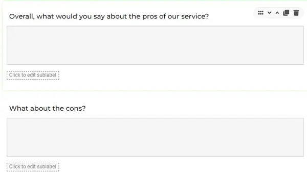
Look at this example on how not to lay out your questions.
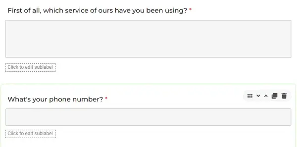
That's literally two in one. The questions are not relevant to each other,
and, considering that this example is from a customer satisfaction survey, the second question is unnecessarily asking for private information.
Not good, at all.
Difficulty Based Order
Well this is pretty straightforward.
You want to put your questions, or question chunks, in a "from-easy-to-hard" order.
So, let’s say you’re asking my name in a question, and asking about my experience in academic writing in another.
I better not see the latter question at the beginning of the form.
Not a good idea. It’s ideal if I start with the rather easy questions, and then gradually meet the challenging ones.
Conditional Logic
This is another strategy that will work great with long forms. It will also help you deal with irrelevancies.
Conditional logic functions as an “if - then” pattern.
So, the filling process takes different turns based on what answers the respondent gave to previous questions.
As a result, the process becomes more on-point for the respondent, and irrelevant questions are taken out.
If I answer “no” to the question “Are you coming to the event?”, there is no point in me seeing the following question “How many guests will you bring with you?”
This is a very basic example. Conditional logic can turn a complex and long form into a simple and on-point ride.
Progress Bar
This is a more specific function, but it’s a great one.
A simple bar at the top of the page, tracking and showing my current progress, would be great. Wouldn’t it?
With the progress tracker, I pretty much know how long it will take me to finish the form. I know where I am, and how much is left to be gone through.
A progress tracker is very useful in trying not to lose people during the filling process.
Visuality
Well, this is a good time to say “last but not least at all”.
Visual aspects of your form play massive roles for purposes like:
– keeping respondents with you at the beginning
– making sure the possible intimidation is reduced to minimal
– drawing attention
According to an infographic (Nadya Khoja, July,2021) from venngage,
24 percent of marketers said that visual content is quite important to their marketing strategies,

52 percent said it’s very important,

and about 10 percent basically said their marketing strategies are nothing without visual content!
The findings make what’s clear, crystal clear.
In the digital realm, running an online business, you have to make your web content visually appealing.
People really care about how the content, in our case a form, looks.
Let’s get into some specifics.
Questions Based on Imagery
Depending on the builder you use, this is a function you can benefit from.
You can have your options listed as images, instead of boxes of text.
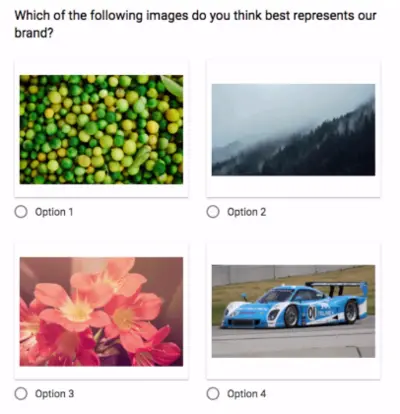
However, this sort of image based questions do have their limits, as not all options can be described with images.
Plus, open-ended questions just won’t work with imagery.
Still, you can make use of the imagery option when you see fit.
Coloring
Here, I’d like to start with a warning.
Visuals can and will improve your form design. Correct.
But be careful, you don’t want to over-visualize your form, complicate the hell out of it, and scare away your respondents after their eyes are burnt up.
There is a fine line between a visually great looking form and a colorful disaster.
I’d personally suggest that too many different colors would border on disaster. So, you can stick with a couple of colors that match each other.
Brand Coloring / Logo
This is worth the emphasis.
As a brand, you have certain colors and a logo that define you.
It’s a great idea to brand your forms up with the same colors, in the same way they are designed for your business. Add your logo to that if possible, and voila!
Your form will look much more professional. It will be identifiable, especially as you grow your business. It’ll be trustworthy, and unique.

In time, when people see a form of yours, anywhere on the web, most will directly know it’s you, and that they’re in safe hands!
The End, For Now
I hope this article will help us all avoid the meh moment as much as possible. In order to keep respondents with us and prevent unwanted form-abandonments, we should be very careful with the structure of our forms.
This article gets updated regularly.